Daikin Connect Dealer
UX/UI Designer
2023-2024

The Client

The Daikin Connect Dealer Mobile App is a powerful tool designed specifically for HVAC dealers. It streamlines and enhances the management of customer relationships, service scheduling, and sales tracking. The app provides real-time access to customer data, product information, and service histories, enabling dealers to deliver exceptional service and maintain strong customer connections.

Overview

Objectives

  1. Enhance Usability: Simplify the navigation and make the app more intuitive for dealers.

  2. Modernize the UI: Update the visual design to align with contemporary standards and Daikin’s brand identity.

  3. Improve Functionality: Add new features that meet the needs of the dealers and their customers.

  4. Increase User Engagement: Ensure that the app is engaging and easy to use to encourage frequent usage.

User Research

Key Features

Key Features

Intuitive
Navigation:

Intuitive
Navigation:

Implemented a bottom navigation bar for easy access to main sections and simplified the layout to reduce cognitive load and simplify navigation.

Order
Management:

Order
Management:

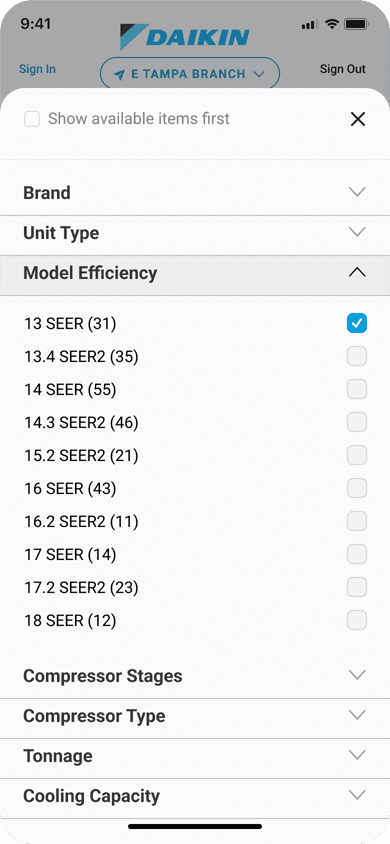
A comprehensive order management system that allows dealers to track and manage orders efficiently. The system includes filters and search functionality to quickly find specific orders.

Service
Updates:

Service
Updates:

Dedicated section for service updates, ensuring dealers can provide timely information to their customers. Additionally, I have integrated push notifications to keep users informed about critical updates.

Intuitive
Navigation:

Implemented a bottom navigation bar for easy access to main sections and simplified the layout to reduce cognitive load and simplify navigation.

Order
Management:

A comprehensive order management system that allows dealers to track and manage orders efficiently. The system includes filters and search functionality to quickly find specific orders.

Service
Updates:

Dedicated section for service updates, ensuring dealers can provide timely information to their customers. Additionally, I have integrated push notifications to keep users informed about critical updates.

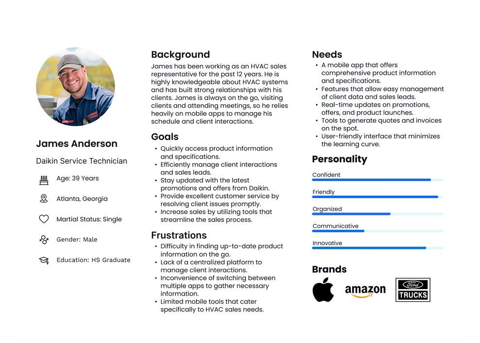
User Persona

Henry Rollins

Sr. Service Technician

Age: 51 Years Old

Charlotte, North Carolina

Martial Status: Married

Gender: Male

Education: Some College

Background

Henry has over 25 years of experience in HVAC systems, with a deep technical knowledge of Daikin products. He started his career as an apprentice and worked his way up to his current role. Henry has seen the evolution of technology in the HVAC industry and is highly respected for his expertise.

Goals

• Efficiently manage service

schedules and customer requests.


• Quickly access product information

and troubleshooting guides while

on-site.


• Streamline reporting and

communication with the Daikin

team.

Frustrations

• Frustrated by slow or non-

responsive apps, especially when

on-site with a customer.


• Finds it challenging when software

updates disrupt his workflow

without clear instructions.


• Prefers minimal data entry—wants

to spend more time in the field than

on a screen.

Needs

Suggests improving the offline functionality, as he often works in
areas with poor signal. He also recommends a feature to voice record notes directly into the app, which would save time typing on small screens.

User Personas

Design Process

Low-Fidelity Wireframe

I started the design with low-fidelity wireframe sketches to map out the app’s basic structure and user flow. These sketches were kept simple and focused on the layout, ensuring that all necessary features were included without getting bogged down in details. The goal at this stage was to visualize the core functionality and make quick iterations based on feedback from stakeholders and potential users. These wireframes were essential for aligning the team on the overall direction before moving on to more detailed designs.

High-Fidelity Wireframes

Once the low-fidelity wireframes were finalized, I transitioned to creating high-fidelity wireframes using Figma. This stage involved refining the design with precise details, including typography, color schemes, and interactive elements. The high-fidelity wireframes closely resembled the final product, providing a clear vision of how the app would look and function. I focused on ensuring a clean, user-friendly interface, with intuitive navigation and responsive design, considering the diverse environments in which the app would be used. These high-fidelity wireframes were then used for usability testing, where I gathered further feedback to make any necessary adjustments before development.

Outcome

The redesigned Daikin Connect Dealer app has been performing exceptionally well, receiving a perfect 5-star rating on the Apple App Store. This outstanding rating is a true testament to the positive reception from users. The app’s redesign has resulted in increased user engagement, with its enhanced usability and modern UI design contributing to higher levels of interaction. Additionally, the updated design successfully aligned with Daikin’s brand identity, contributing to enhanced brand consistency.

Reflection